Metro Vancouver Home Prices Are "Back to 2016." Here's Why That's the Wrong Way to Say It.
Ask anyone old enough to remember and they'll tell you what they paid for their first place, and the number will sound almost fictional today: $220,000, $180,000, less than some parking spots cost now. It's tempting to look at a jump like that and decide housing has become permanently, impossibly more expensive. But that comparison is doing something sneaky underneath the surface: it's treating a dollar from back then and a dollar today as the exact same thing, when they aren't, not even close.
Here's the distinction in one picture:
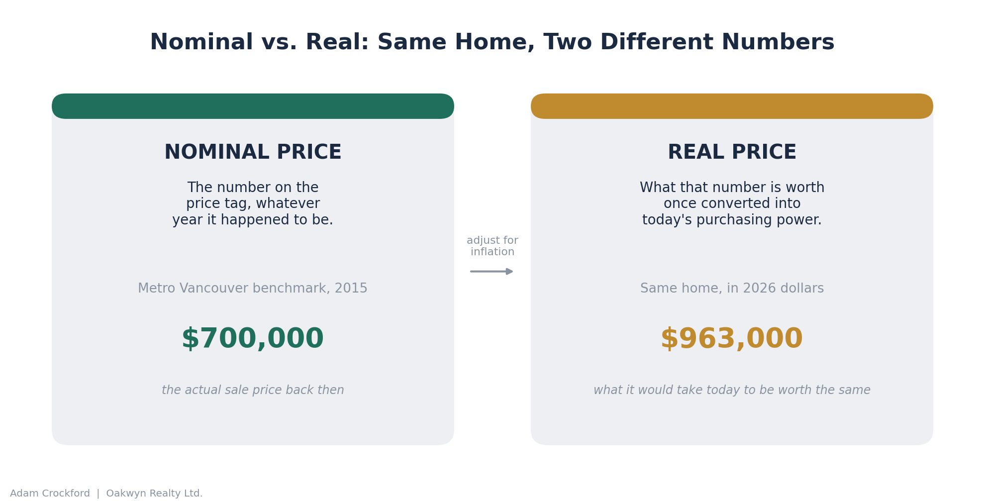
That's the whole trick. Nominal tells you what something cost. Real tells you what it actually cost, measured in dollars you'd recognize today.
Nowhere does that gap matter more right now than in a market that's been front-page news for two decades straight. Here's a sentence you won't see in any other Metro Vancouver market update:
In real, inflation-adjusted terms, Metro Vancouver home prices are back to where they were in 2016.
That's not a typo. Not 2023. Not 2019. 2016, before the foreign buyer tax, before the mortgage stress test, before two entire boom-and-bust cycles played out in the years since. When you strip inflation out of the picture and look at what a benchmark home actually costs in terms of real purchasing power, today's prices sit in roughly the same place they did a decade ago.
But that headline, while technically true, is also a little bit of a trap. By the end of this article you'll see why, and you'll walk away with the two numbers that actually matter more than "2016" does.
Start with what everyone already knows: the nominal chart
This is the chart you've seen a version of before, benchmark price, plotted month by month, no adjustments. It's the one from your own market report, and it tells the story most people already have in their heads.
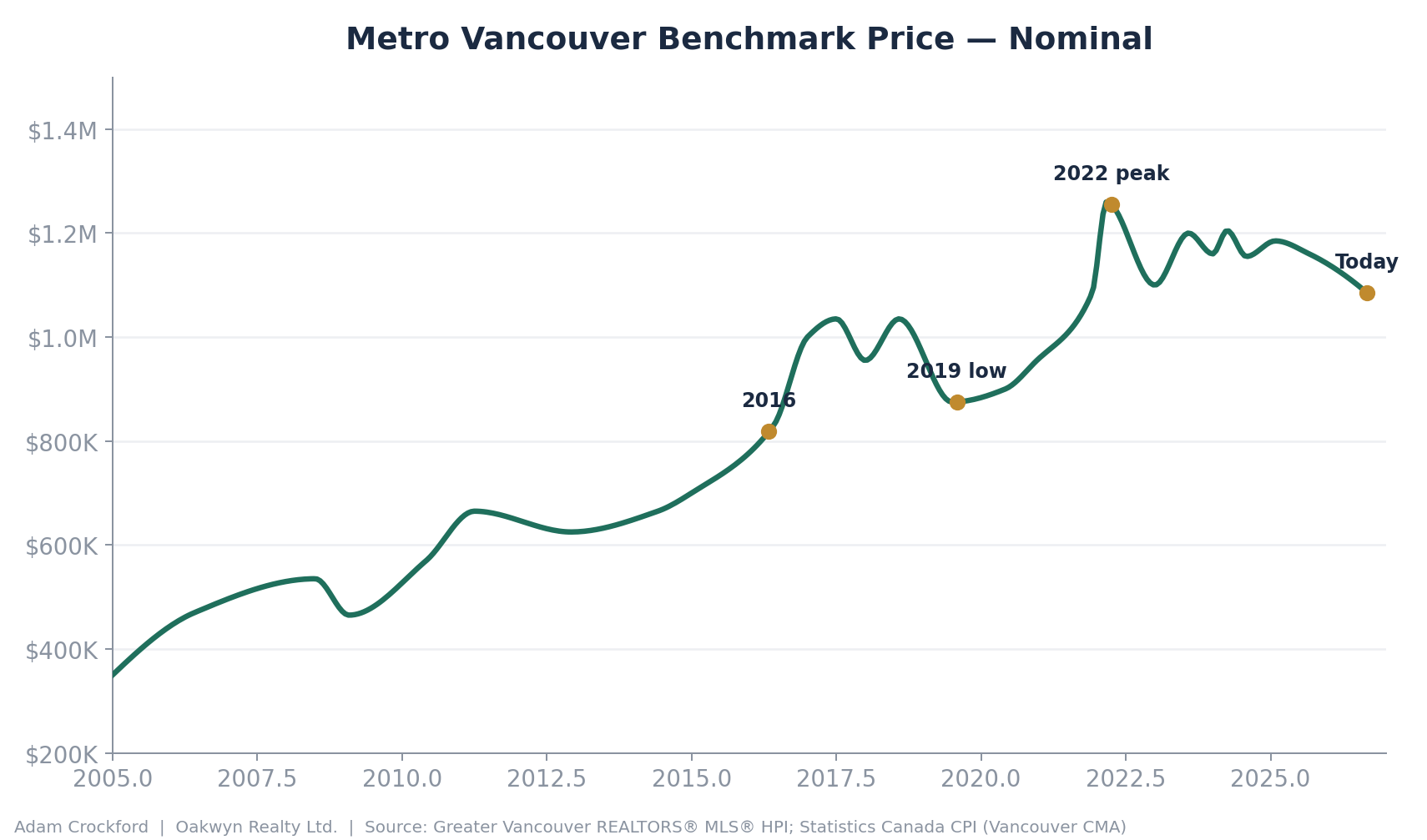
Home prices tripled between 2005 and today. They crashed in 2008, boomed through 2011, cooled off in 2012 and 2013, then went on the run everyone remembers: 2016 through early 2018, a dip, a run to a second high, a pullback into 2019, and then the pandemic-era spike that peaked in spring 2022. Since then, prices have drifted down and sideways.
Read purely in dollar terms, today's benchmark price is about 14% below the 2022 peak. That's the number most headlines use. It's not wrong. It's just incomplete, because it treats a dollar today the same as a dollar in 2022, or a dollar in 2005. It isn't.
The part most price charts leave out: the ruler is moving too
A dollar buys less every year. That's inflation, and over a 21-year window it adds up to a lot more than people intuitively expect. Here's what the cost of living has done in Vancouver specifically over the same stretch, using Statistics Canada's Vancouver-area Consumer Price Index rather than the national number, since local cost of living is what actually matters for a local price comparison.
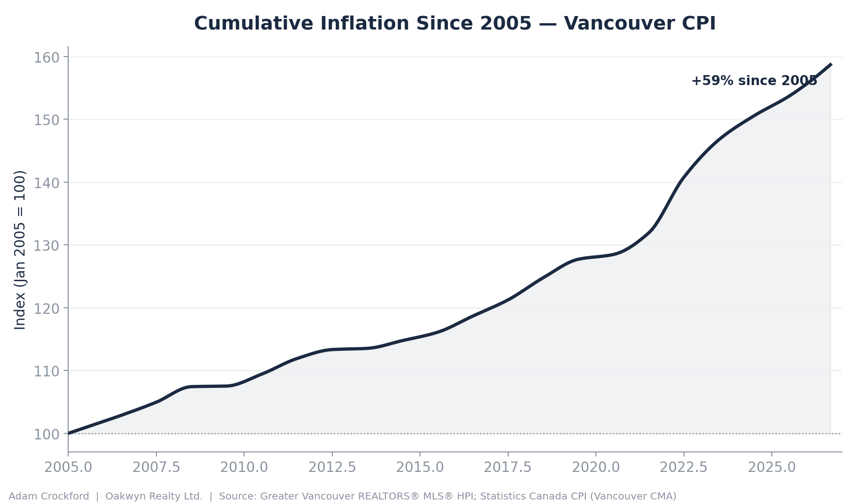
A basket of goods that cost you $100 in January 2005 costs roughly $157 today. That's not a wild inflation story, it's mostly just two decades of ordinary price growth with one loud stretch in 2021 to 2023. But it means every dollar figure on that first chart needs to be translated into today's purchasing power before you can fairly compare one year to another. A $700,000 home in 2015 and a $1,085,000 home today aren't actually as far apart as the sticker prices suggest, because the $700,000 was already worth more in real terms than it looks.
The cumulative chart above tells you the total distance travelled, but it hides which specific years did the damage. Broken out year by year, the picture is far less smooth than "two decades of steady inflation" suggests:
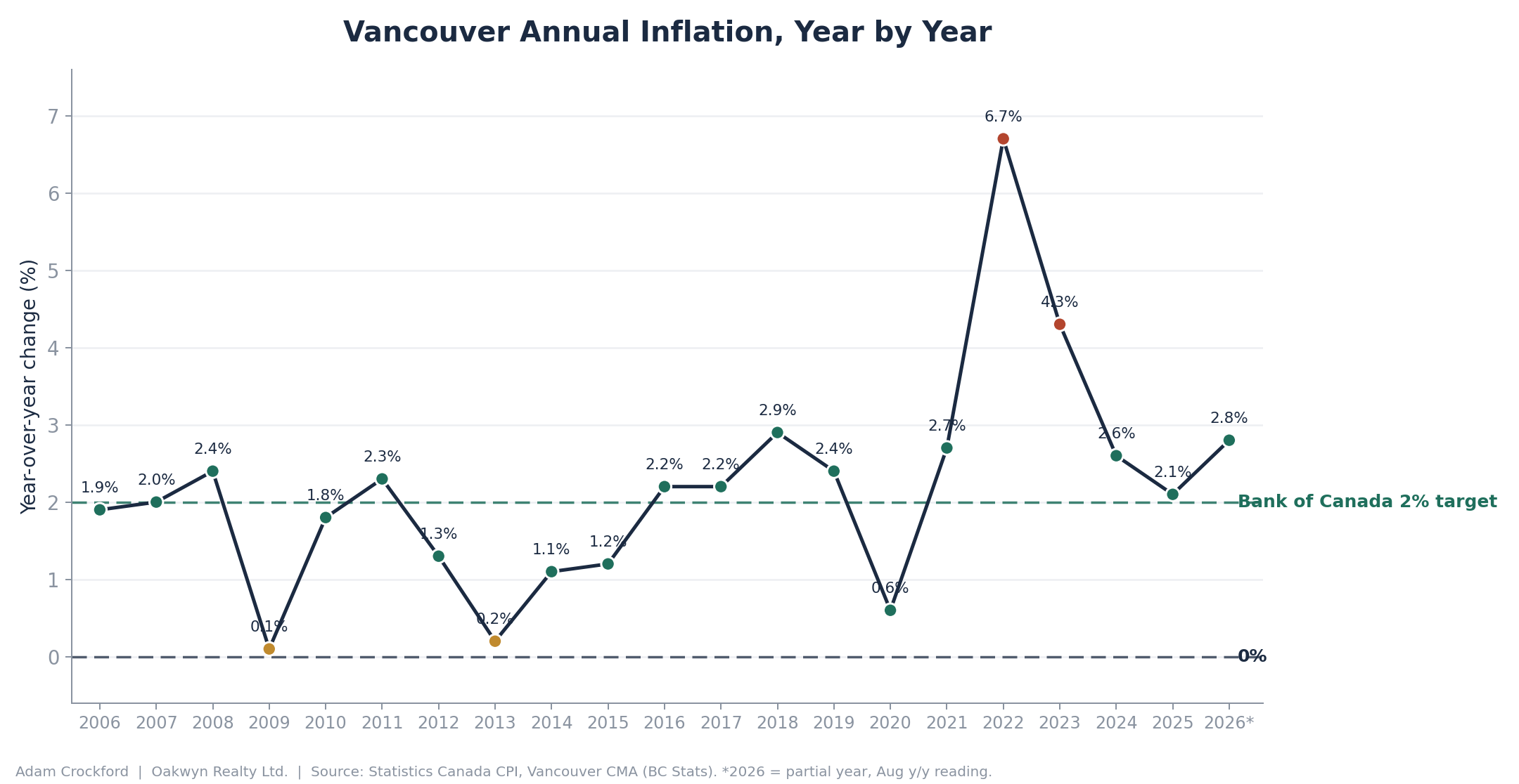
Most years since 2006 sat close to, or comfortably below, the Bank of Canada's 2% target. Then 2022 alone added 6.7% on top of prices that had already run hot in 2021, and 2023 piled on another 4.3%. Two years, roughly 11% of cumulative price growth between them, more than the entire 2012 to 2015 stretch combined. That two-year burst is doing most of the work in the cumulative chart, and it's also the reason the gap between the nominal and real price lines widened so sharply right around the same time the 2022 housing peak hit. Home prices and the cost of everything else spiked in the same window, which is part of why that particular peak looks so much more extreme once you adjust for it.
Now the reveal: what the price chart looks like once you adjust for that
Take every point on the first chart and restate it in today's dollars. This is what you get.
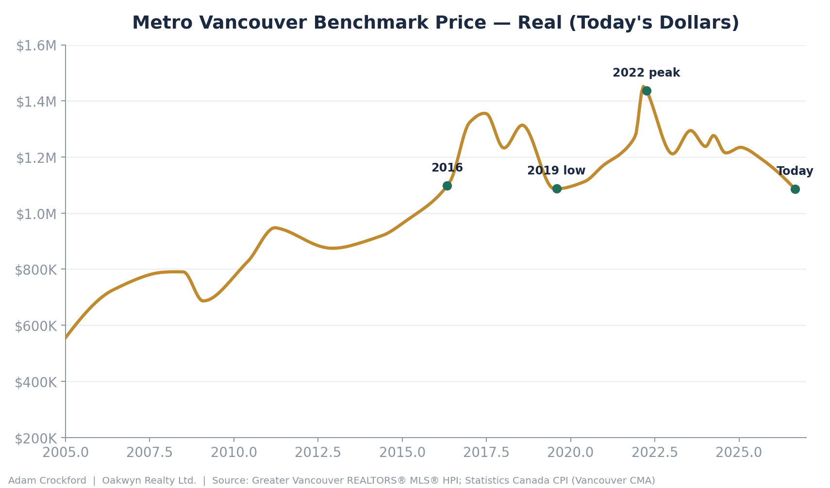
The shape changes in a few important ways. The 2005 to 2008 run-up looks smaller. The 2012 to 2015 "quiet years" look less quiet, because prices were still climbing in real terms even when the nominal chart looked flat. And the right side of the chart, the part everyone actually cares about, tells a more dramatic story than the nominal version does: today's real price isn't just off its 2022 high, it's fallen all the way back through the entire 2020 to 2025 stretch and landed almost exactly where it sat during a brief window in 2016, and again briefly in 2019.
Put the two lines on top of each other and the gap becomes the whole story:
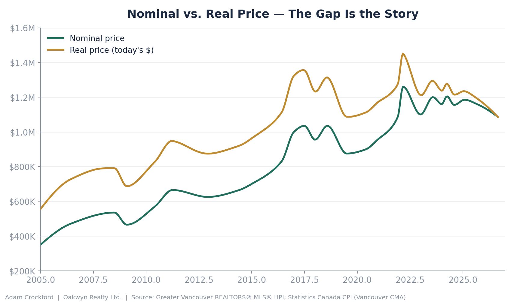
Notice how the gap between the lines widens as you move left. That's inflation compounding, the further back a dollar was earned, the more it's worth today. And notice how the two lines converge at the far right edge. That convergence is a real thing happening right now, not an artifact of the math: because inflation has been running above the Bank of Canada's target for several years straight, nominal prices haven't needed to fall very far to represent a real decline. A market that merely goes sideways in nominal terms while inflation runs at 3% is still getting cheaper in real terms, year after year, without a single "price cut" ever showing up in a market report.
So why not just say "prices are back to 2016"?
Because 2016 is a bad landmark, even though the math checks out. A few reasons:
2016 wasn't a resting point, it was mid-sprint. The real chart crosses today's level somewhere around spring 2016, right in the middle of the steepest run-up in the entire dataset. Prices moved by hundreds of thousands of dollars within that single year. "2016" isn't one number, it's a moving target, which makes it a weak thing to anchor a claim to.
It invites confusion with the nominal number. Anyone who remembers 2016 remembers nominal prices in the $700,000 to $800,000 range, not $1.08 million. Say "back to 2016" and most people's brains will reach for that lower nominal figure, not the inflation-adjusted concept you actually mean. You end up technically correct and practically misleading in the same sentence.
It erases an entire cycle. Between 2016 and today, this market ran up hard, cooled, ran up again even harder into 2022, and has now given most of that back. "Back to 2016" makes it sound like nothing happened in between. What actually happened is a full round trip, and that's a far more useful thing for a buyer or seller to understand than a single point of comparison.
The two numbers that actually matter more
Instead of anchoring to 2016, here are the two comparisons that hold up better, because both are genuine turning points in the market rather than a random spot on a steep climb:
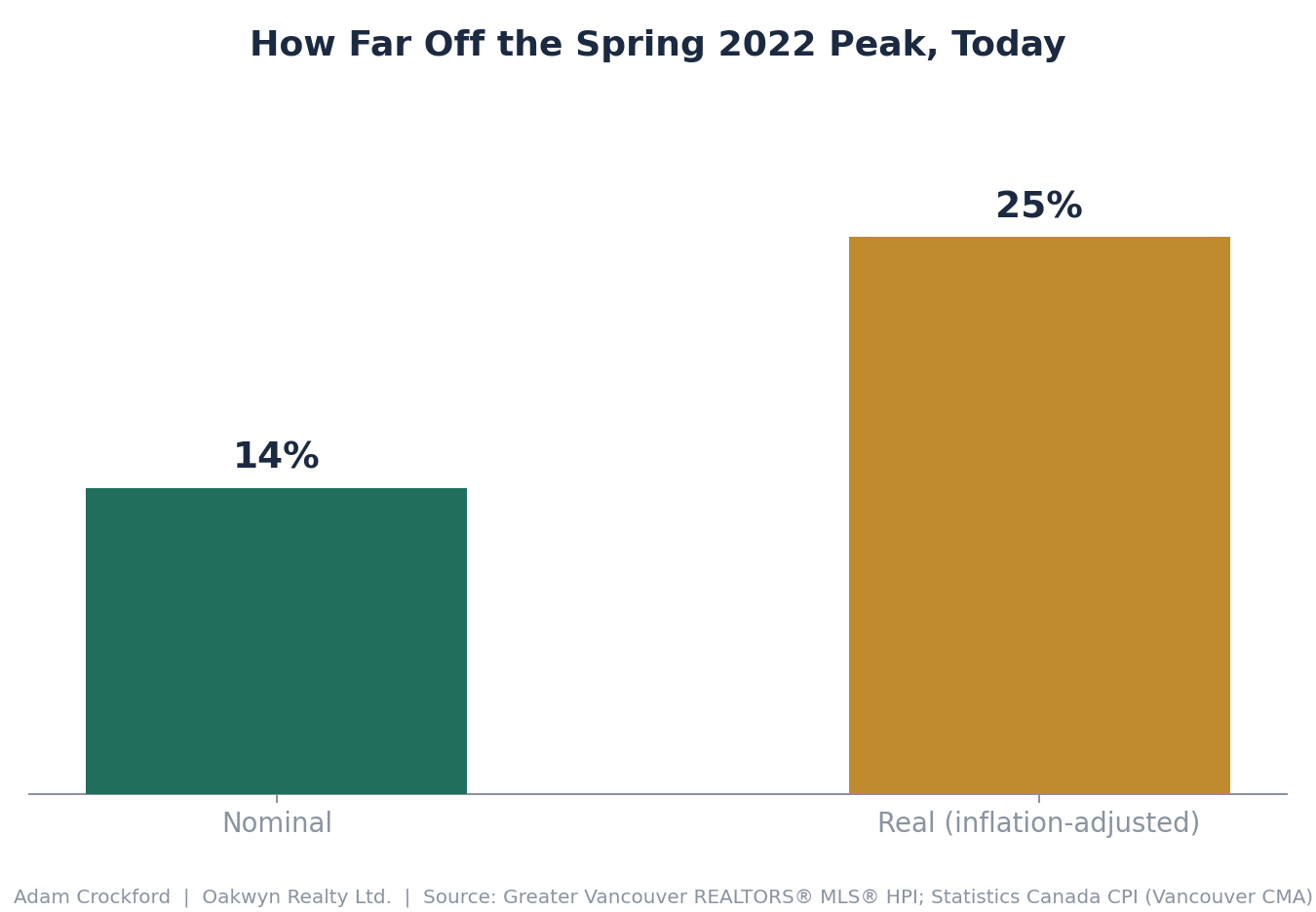
Down roughly a quarter from the spring 2022 peak, in real terms, compared with about 14% in nominal terms. That's the headline number that should actually be leading these conversations. The market has given back meaningfully more purchasing power than the sticker price alone suggests.
Back to the pre-pandemic low of mid-2019, in real terms. This is the more useful "same as" comparison, because 2019 was an actual bottom, not a random midpoint. It also means the entire 2020 to 2022 pandemic-era price surge has now been fully erased in purchasing-power terms, even though nominal prices are still well above where they were in 2019.
What this means if you're trying to buy
If you've been sitting on the sidelines waiting for prices to feel "cheap again," this is worth sitting with. In nominal terms, this still looks like an expensive market relative to a few years ago. In real terms, the picture most people are actually reacting to when they say a purchase feels affordable or not, today's Metro Vancouver market has already round-tripped most of the pandemic-era gains and sits close to where it stood at a genuine pre-COVID low point.
That doesn't mean prices are guaranteed to keep falling or guaranteed to bounce back. Markets don't work off a script, and this is a look backward, not a forecast. But it does mean the "prices are still too high" instinct deserves a second look once you account for what a dollar is actually worth today versus a few years ago. If you're trying to figure out what that means for your specific timeline and budget, that's a conversation worth having before you assume the window has closed.
Data: Greater Vancouver REALTORS® MLS® Home Price Index (benchmark price, all residential); Statistics Canada Consumer Price Index, Vancouver CMA, 2002=100. Chart figures are drawn from GVR public benchmark data and reflated using Vancouver-area CPI; exact monthly values may vary slightly from GVR's own published series. Historical price trends are not a guarantee of future performance.